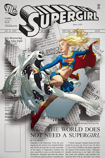
I have to say that so far I have been completely enamored of the Joshua Middleton Supergirl covers. They are very stylish, just the perfect tinge of japanese manga without being over the top.
So I was happy to see him share the pencil/ink work of the covers on issues 34 and 37 on his blog. Here is the link: http://joshuamiddleton.blogspot.com/2008/11/supergirl-lines.html
I enjoy any time an artist can share the creative process. From thumbnail to pencils to final cover, I enjoy watching the evolution of a particular piece. This was no different.
You can see how clean this pencil work is before the coloring and shading occurs. This is pretty fine line work here, but without much added to convey depth, texture, or dimension. That was added via the coloring process as we see the light source from the left casting shadows as the two burst from the printed page.

Compare that to the cover of Supergirl #37.
 Much more shading has been added here, with pencils doing more of the work to detail Superwoman's musculature, the flow of her cape, etc. from the light source below.
This cover really works for me. For one, I think Middleton does a great job of giving her a feeling of movement and action despite this being a simple a figure drawing with no background or other reference points. When the 're-entry sparks' of her boots are added in the coloring process, you really have a dynamic piece.
I am impressed that Middleton is able to subtly change styles like this and pull of both covers so wonderfully. If the three Supergirl covers we have seen are an indication, I hope he has a long run with the title.


HEAR, HEAR!
ReplyDeleteThe man can simply do no wrong in my book! (And boy would I certainly give my left arm to be able to draw in the particular style he does ah! :D)
Hmmmm, I wonder, do you think the Super suit that our mysterious Superwoman here is wearing is like that of Superman and Supergirl's, in other words made out of Kryptonian indestructible material? Or do you think if it's actually PAD's Linda Danvers under the hood instead her putting together a suit made from regular Earth material being more the case really? I'm actually leaning more towards the first rather then the latter judging by that re entry pose pic alone. :/